Role
Lead Product Designer
Medium
Web Application
Collaborators
2 Project Managers, 3 Engineers, 8 Client Stake Holders
Stack
Figma, Sequoia, Confluence, Youtube API integration
Capital One is a major financial institution renowned primarily for its credit card services, bank offerings, and auto loans. It’s one of the largest banks in the United States, known for integrating technology extensively in its operations.
Capital One saw how Webstacks could support their business goals of optimizing site experience, enhancing user engagement, & driving core KPIs through UX design & web development support.
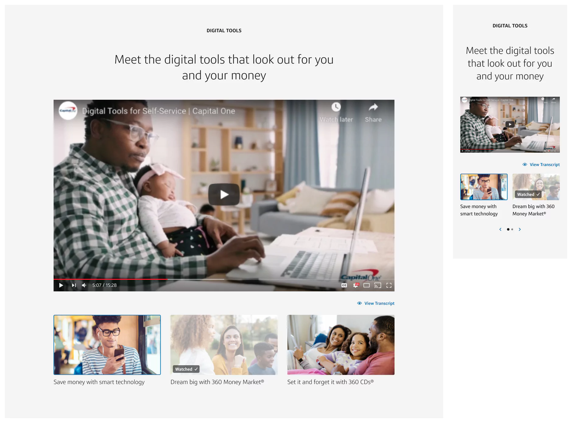
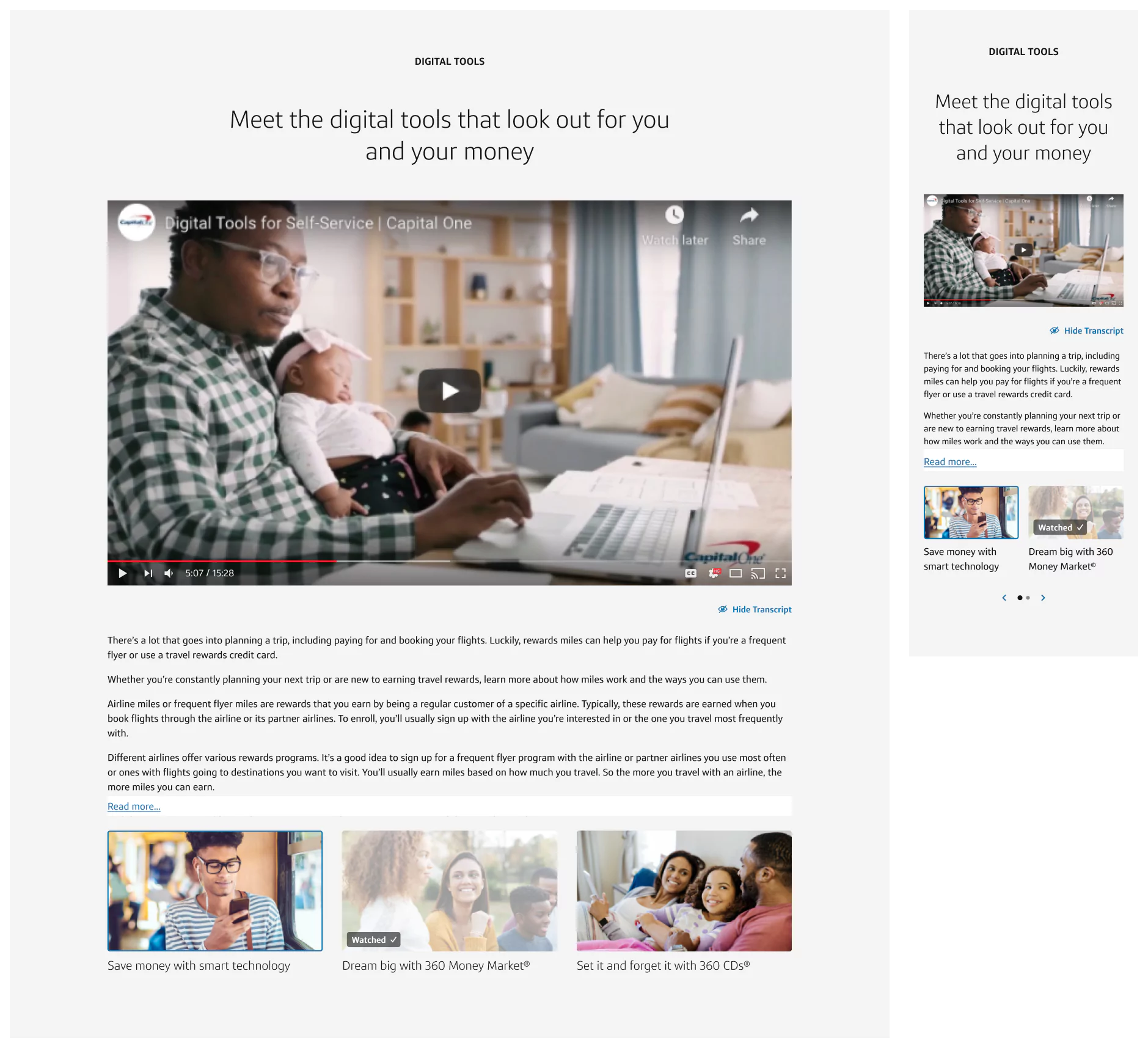
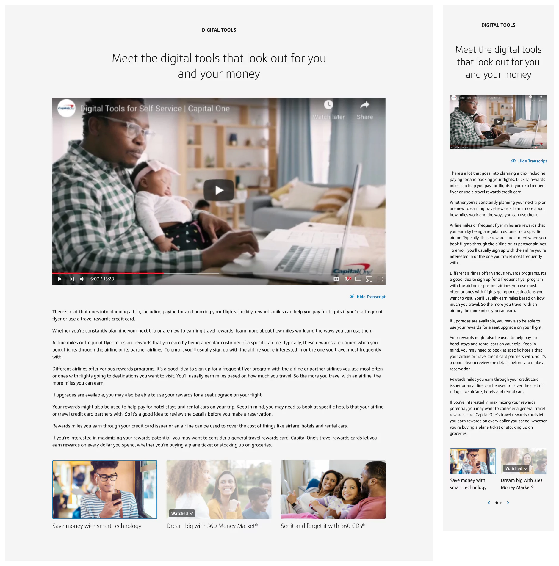
Capital One has a full-width video component in their design system, Gravity, though we found their user needs were not being met and we could update this component to provide more opportunities to meet accessibility and enhance Capital One’s business goals. We wanted to equip users to watch multiple videos at once or a series of videos on topics they were interested in. This would enrich education and help users narrow down the right product for them. Adding a transcript would also improve accessibility, SEO, & legal compliance in many regions. So we decided to create a new video component with an optional playlist and transcript along with a variant that can be nested in articles.
We worked with their team to define what success looks like to achieve their user needs and company goals:
Users would access this component through articles on their Learn & Grow resources along with various product pages across their site. If a user found this component, that means the user is looking to find out more information in an article or is finding which product is right for them.
With most of Capital One’s videos being hosted on YouTube, it made sense to integrate YouTube’s API to pull the transcript copy. Because we were limited to the metadata we could pull from the API, we were only able to parse out copy into sections per speaker.
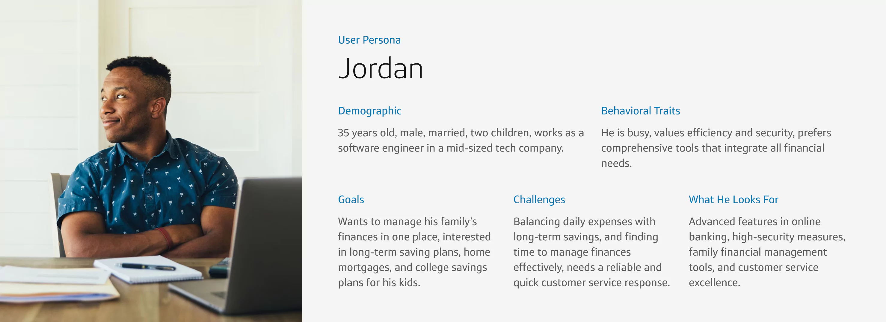
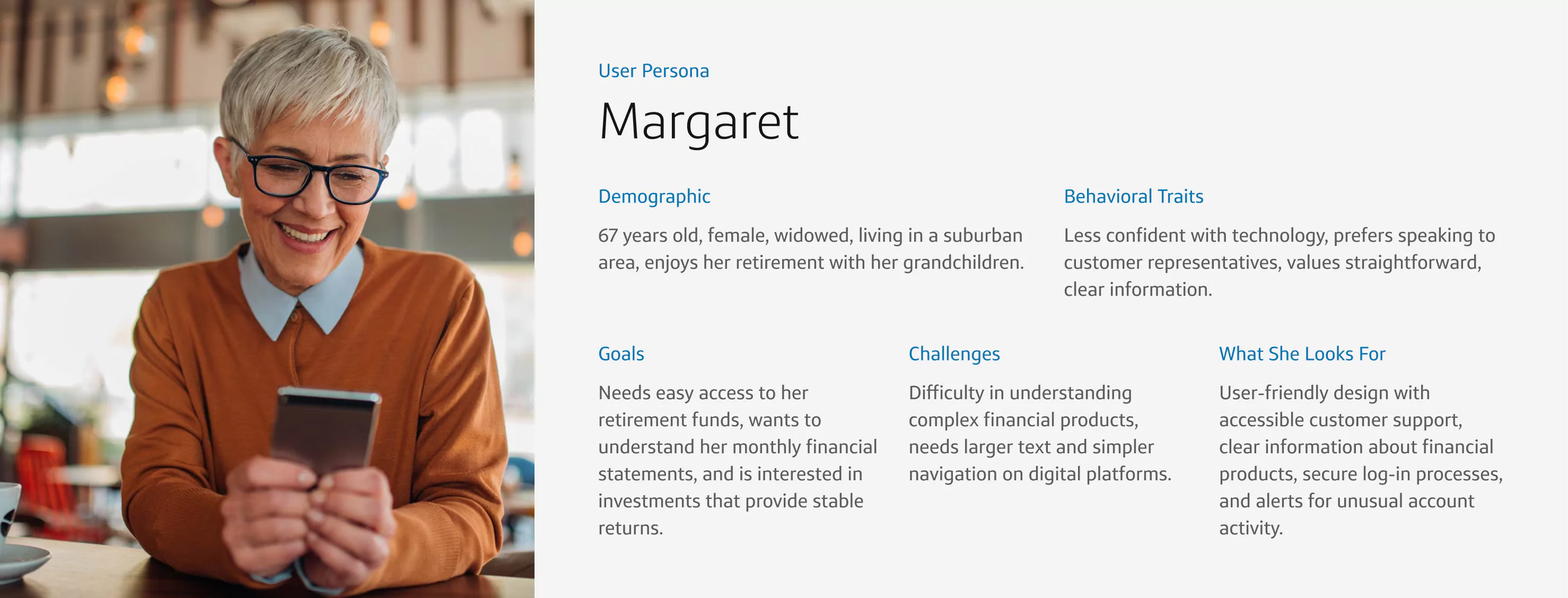
To understand Capital One’s user base, here are 3 personas we kept in mind for who would be using this component:

We still needed to grok key elements around the functionality of this component. I approached our first round of design as an opportunity to better understand our limitations. We designed concepts of what kind of features this component could have and paired down each iteration from there, making sure to keep what was necessary for this component to be successful.


We went through multiple rounds of iterations before landing on the final design. These rounds of iteration were a continuation of finding what else we can take away.
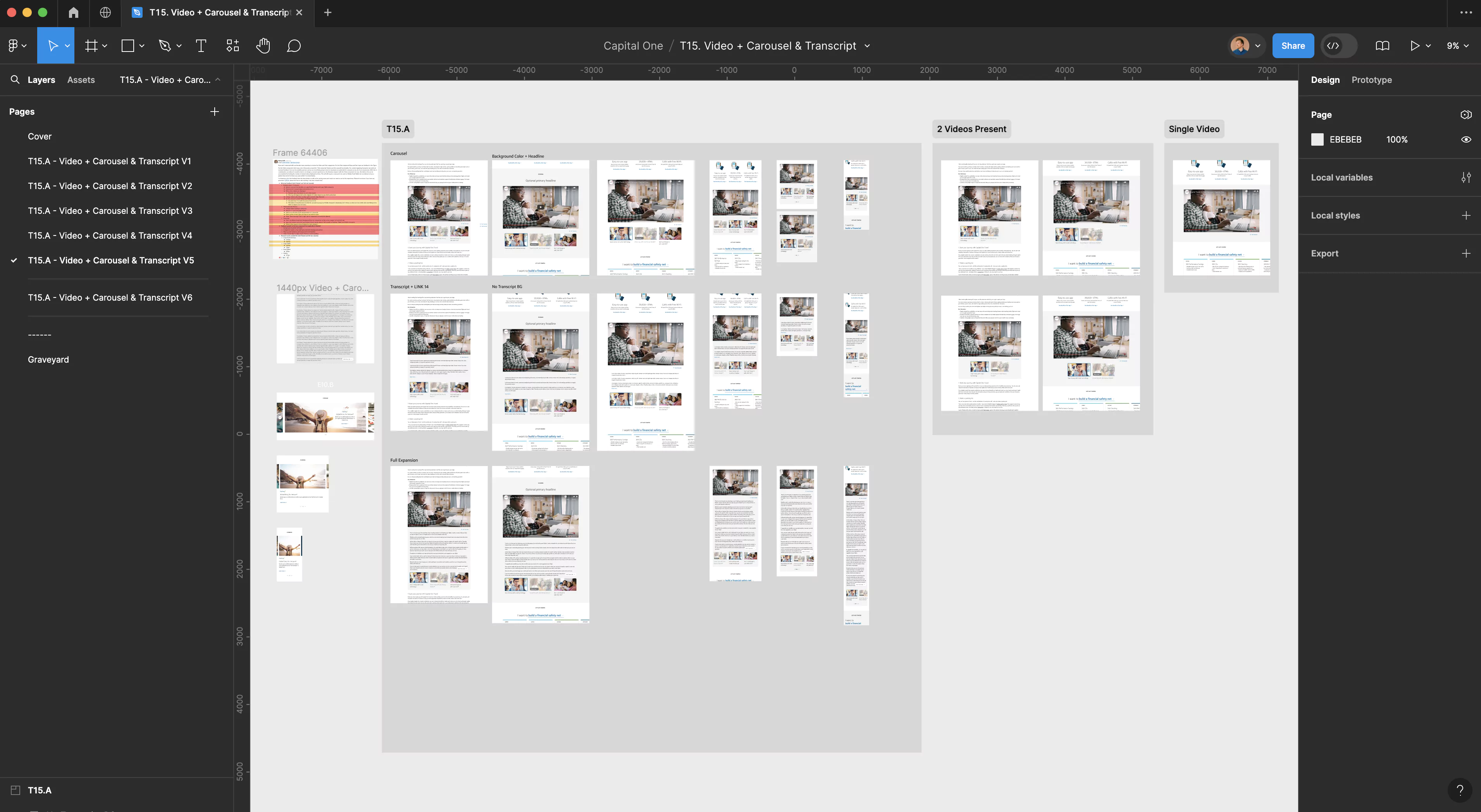
A top priority was how to display the transcript. We needed this section to be accessibility friendly and its button to feel connected to the selected video while displaying a large amount of content. In the first two concept rounds, I experiment with two solutions for the transcript button.
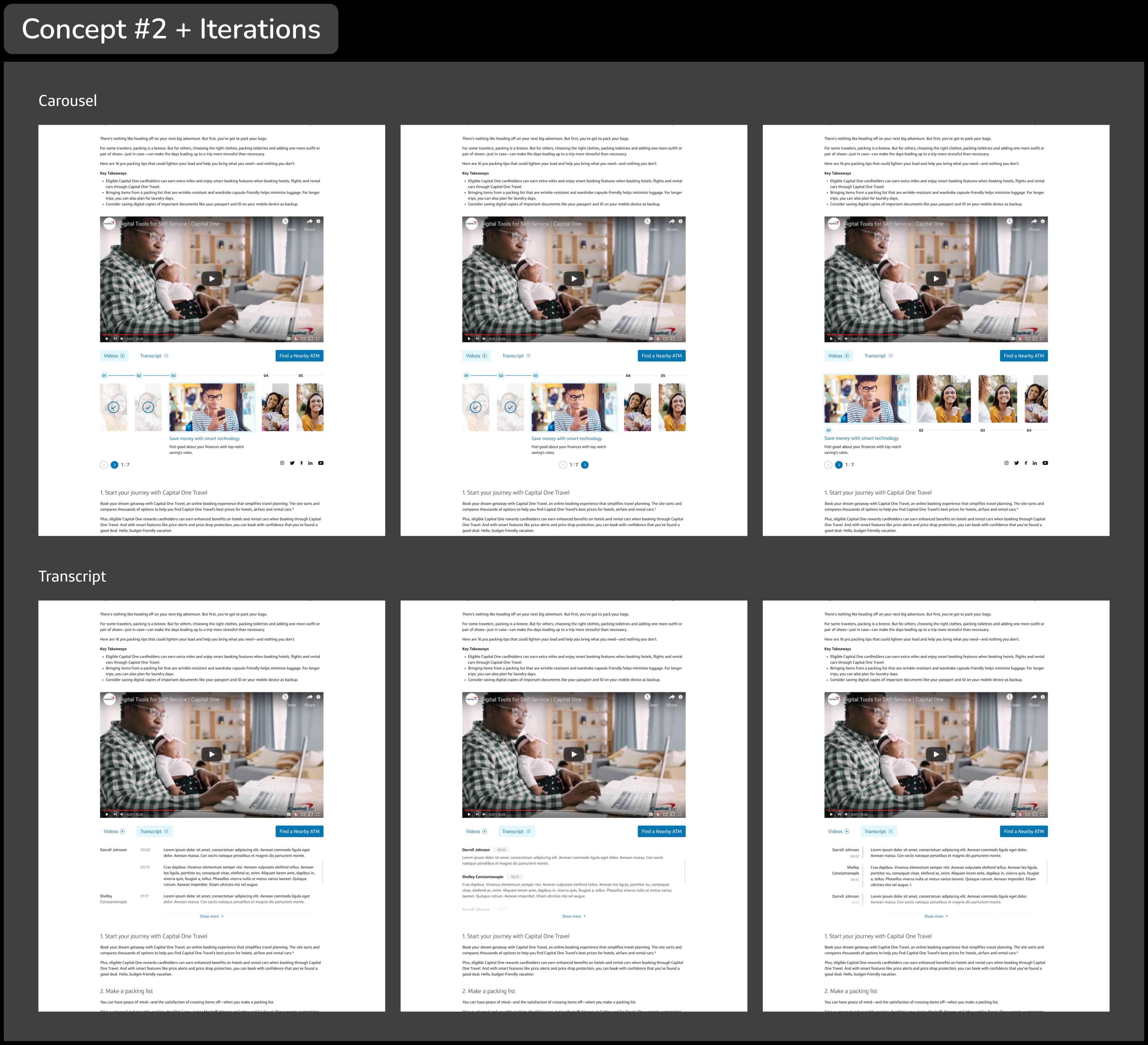
The first concept had tabs for the video carousel & transcript with the carousel selected by default. When the transcript was pressed, a preview of the transcript would open with a “Show More” button that would allow the user to continue reading.
This solution ultimately created friction by hiding the video carousel from users, making them work harder to access it. This also over-emphasized the transcript leading users away from our intended goal.
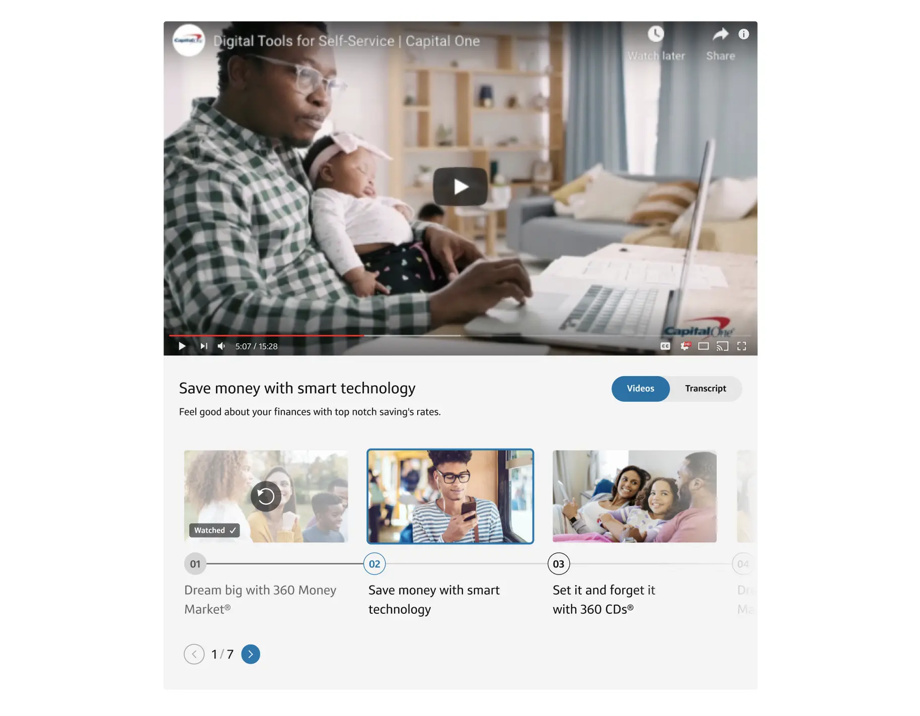

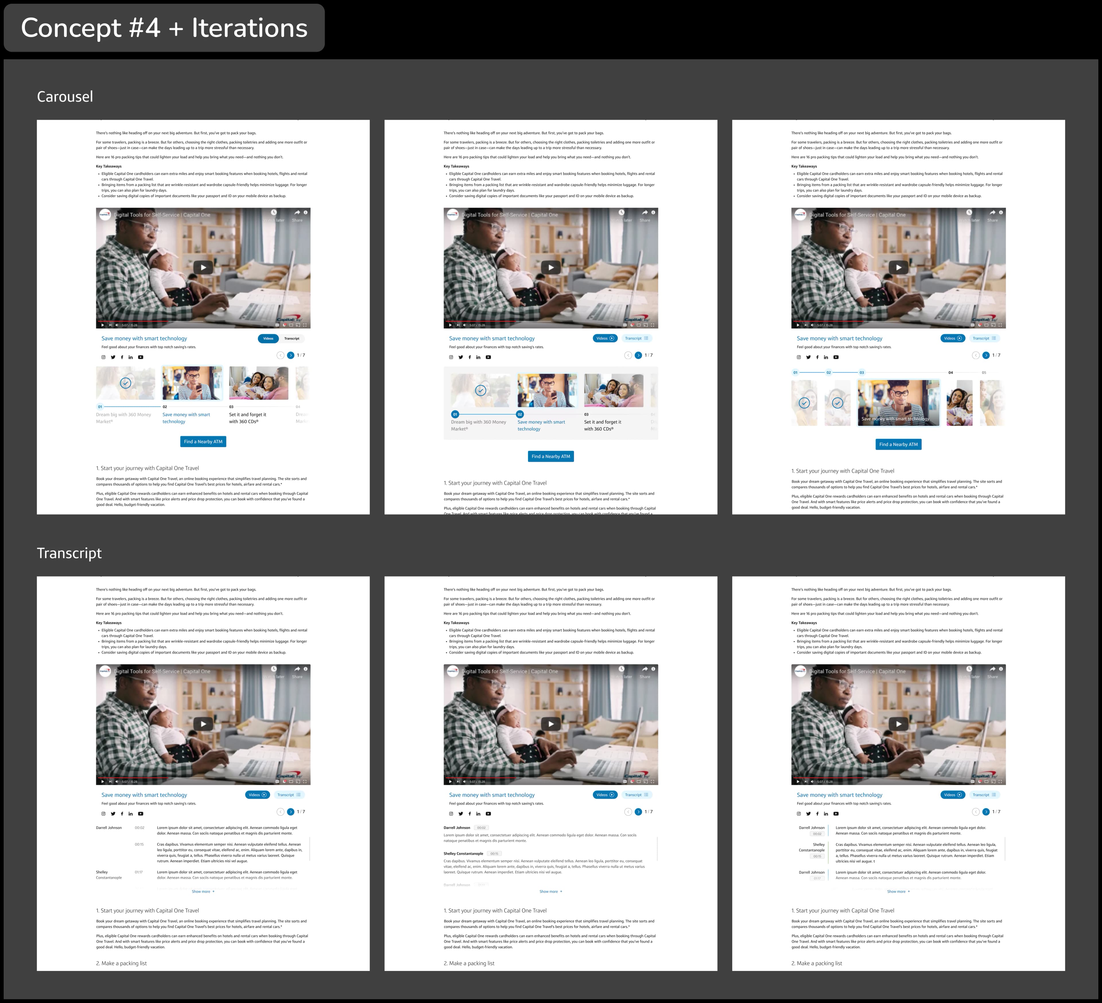
Our second solution had a transcript button instead of tabs that opened a preview of the transcript with a “Read More” button similar to the first concept. When “Read More” was selected the whole transcript expanded pushing the carousel down the page. This solution had a few benefits:
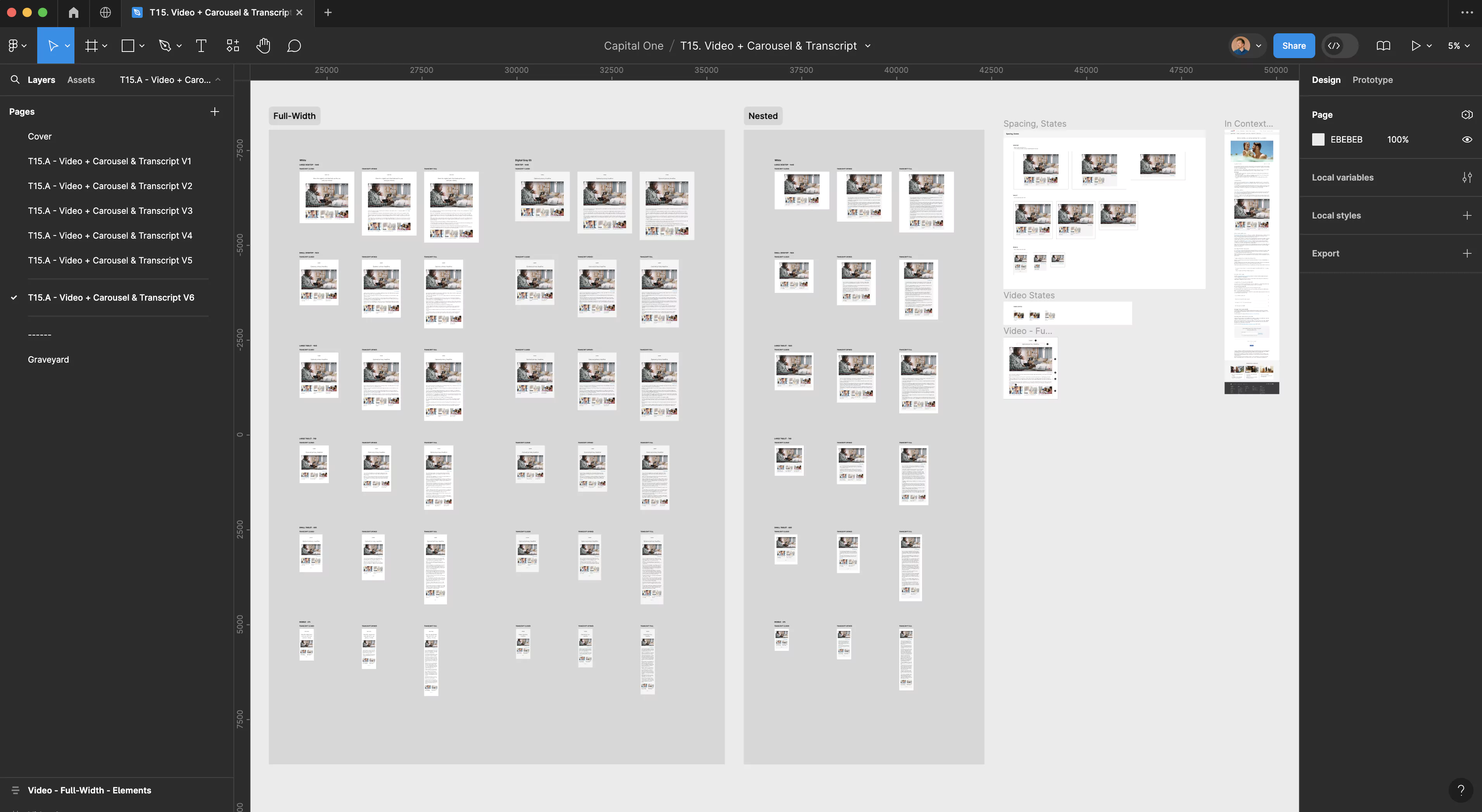
After the Capital One stakeholders approved the latest iteration the accessibility team reviewed the design in Figma.
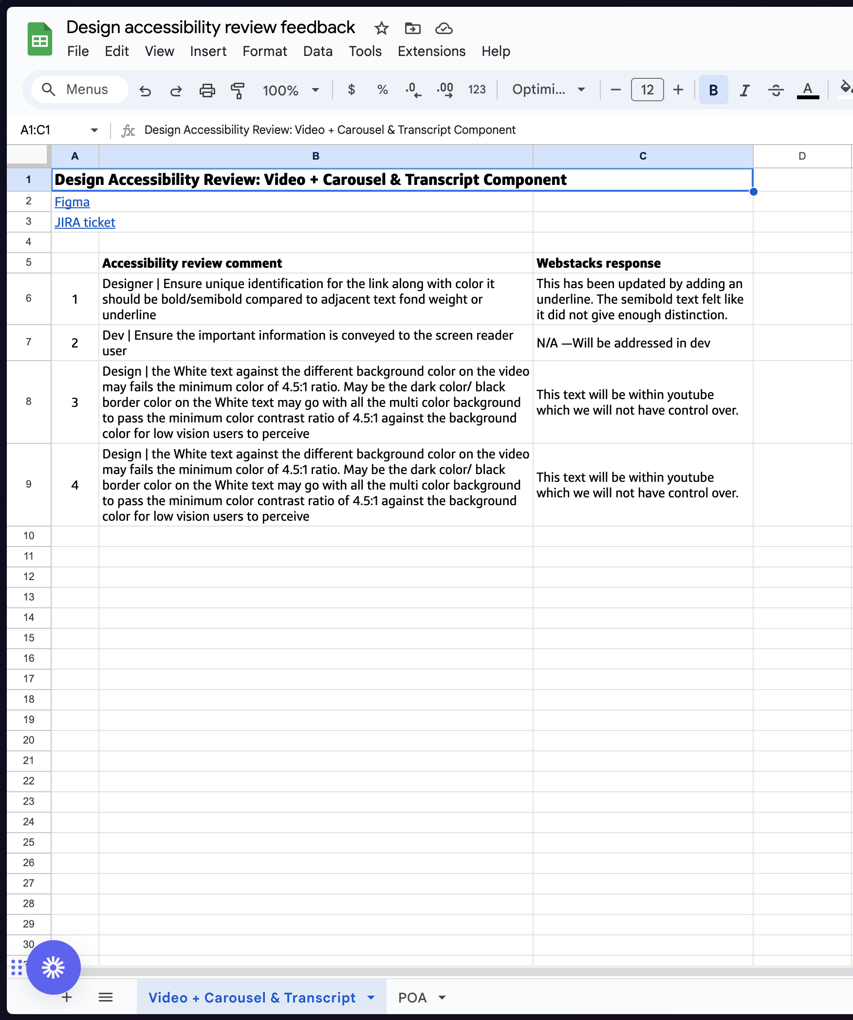
We received minor feedback following the review that was easily updated and immediately passed the designs off to development and began creating documentation in Confluence.
Throughout this project, I practiced trusting my intuition through many rounds of iteration until only the fundamental features were left. Design is not linear and each problem may need more exploration and definition than others. Some problems may have clearer solutions and others you may need to define your goals along the way. It’s okay if it’s not a perfect process. The Capital One team & I are so happy with how this turned out along with the other projects we worked on together.